Plot for persistence_diagram objects
Source: R/persistence-diagram.R
autoplot.persistence_diagram.RdThis function creates a visualization of a persistence diagram and returns the corresponding ggplot2::ggplot object which enable further customization of the plot.
Usage
# S3 method for persistence_diagram
autoplot(
  object,
  dimension = NULL,
  alpha = 0.6,
  max_intervals = 20000,
  legend = FALSE,
  greyblock = TRUE,
  n = 10L,
  type = c("barcode", "diagram", "density"),
  ...
)
Arguments
- object
An object of class
persistence_diagram.- dimension
An integer value specifying the homology dimension to visualize. Defaults to
NULLin which case the dimension is retrieved directly in the persistence_diagram object.- alpha
A numeric value between 0 and 1 specifying the transparency of points and lines in the plot. Defaults to
0.6.- max_intervals
An integer value specifying the maximal number of intervals to display. Selected intervals are those with the longest lifetime. Set it to
0to see them all. Defaults20000L.- legend
A boolean value specifying whether to display the legend about the homology dimension(s). Defaults to
FALSE.- greyblock
A boolean value specifying whether to display a grey lower triangle in the diagram representation for nicer output. Defaults to
TRUE.- n
An integer value specifying the number of bins for plotting the diagram as a density. Defaults to
10L.- type
A string specifyfing the type of representation. Choices are
"barcode","diagram"or"density". Defaults to"barcode".- ...
Other parameters to be passed on to next methods.
Value
A ggplot2::ggplot object.
Examples
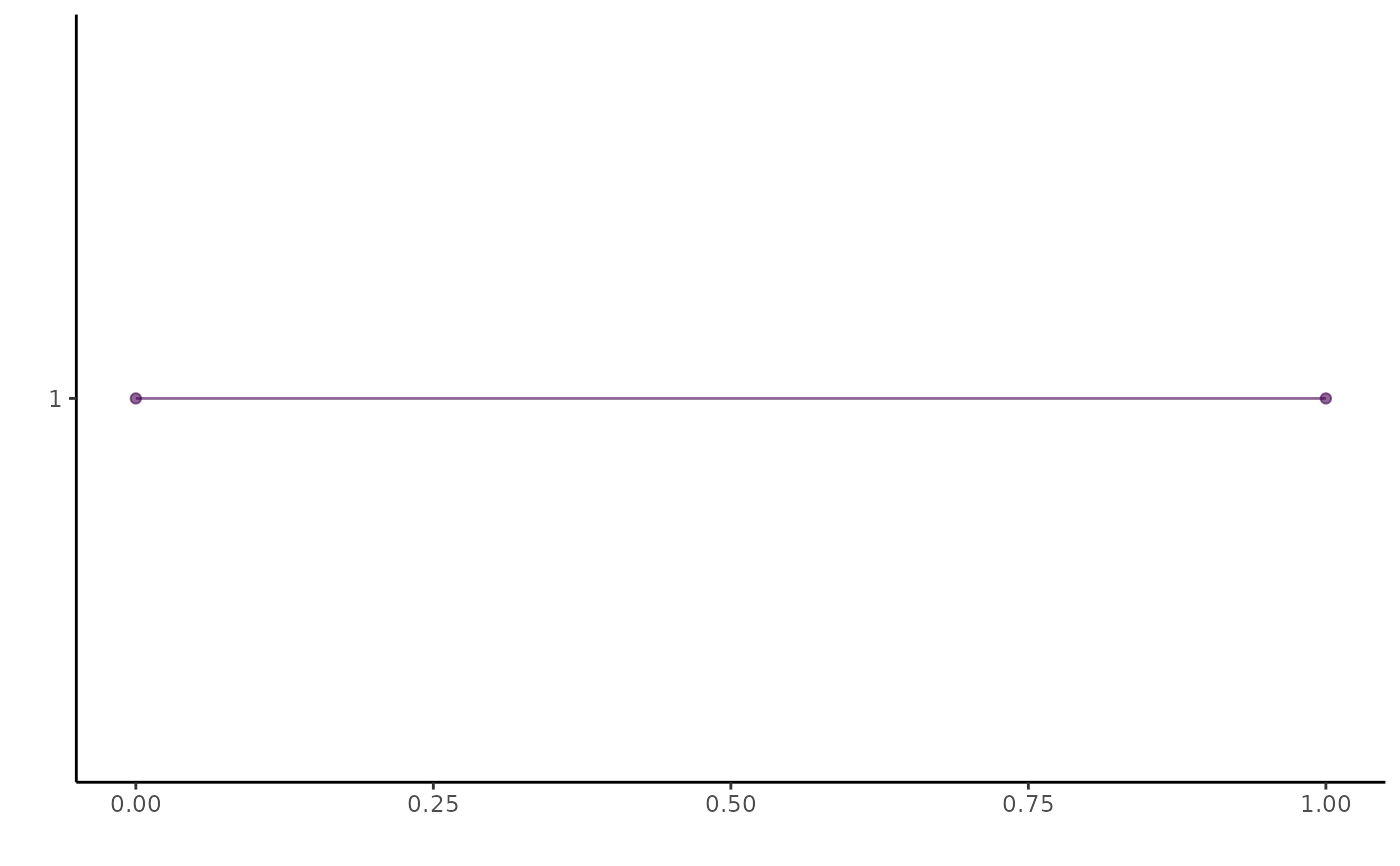
pd <- as_persistence_diagram(tibble::tibble(
  birth = 0,
  death = 1,
  dimension = 0
))
ggplot2::autoplot(pd)